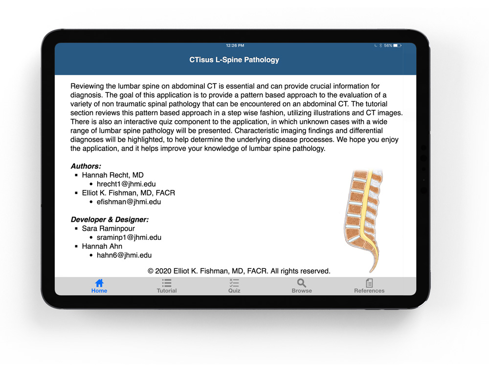
CTisus: L-Spine Pathology is a mobile application that helps radiologists better identify diseases by reviewing abdominal scans of the lumbar spine

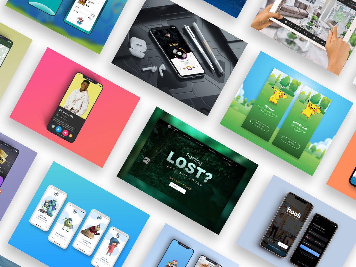
Founded by Dr. Elliot K. Fishman, CTisus is a radiological website dedicated to computed tomography (CT) scanning. The platform has an expansive library of content ranging from CT scan protocols, lectures, and case studies to medical illustrations and a monthly quiz – many of which they have been used to make 17 iOS applications with, including a few that have won awards.
I reached out to Dr. Fishman to see if he was interested in working together to reupholster any one of his many apps. After meeting with him and his development/marketing team, it was decided that the L-Spine Pathology app was the perfect project to work on. At the time, it was exclusively available on the iPad, and because it was initially designed as an interactive display to be shown at a trade-show, it had since outgrown its original application.
It was then decided that we not only redesign the application in its entirety, but also expand its presence.
Our goal was to bring the award-winning depth of information the application had to offer, to a place where the MOST people could have access to it – the iPhone and its App Store.
HOW LONG DID IT TAKE?
Designing: 3 months
Developing: In progress
WHAT WAS MY ROLE?
Sole UX Designer
Researched and designed end-to-end experience
WHAT SOFTWARE DID I USE?
Miro
Framer
Adobe Suite (Photoshop, Illustrator, XD)
Roboto

Students of radiology need an intuitive, time-efficient way to study and learn the pathologies of the Lumbar spine in order to prepare for real cases in the real world.
We aim to decrease cognitive load by simplifying the structure and flow of the app, and offer our users the ability to measure their knowledge and document their progress to improve their understanding of the subject matter.

The stakeholders of CTisus would like to increase the application’s usage (duration and frequency), as well as incentivize users to leave feedback to improve the app’s experience.
We will redesign the L-Spine Pathology app at make it available on the iPhone (as it is more portable and popular than iPad) and increase the opportunities for users to leave feedback and reviews.
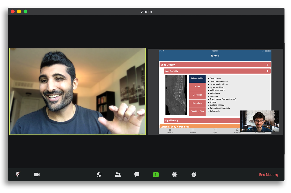
The global pandemic made testing the iPad app difficult, but far from impossible. Thanks to the capabilities of apps like Zoom, I was able to test users remotely and gather valuable feedback about the current experience of the app.
The participants were...
Students with medical aspirations
Familiar with using mobile devices for learning
They were asked...
To complete various specific tasks
Vocalize their thought process throughout
Give feedback of their pains and struggles
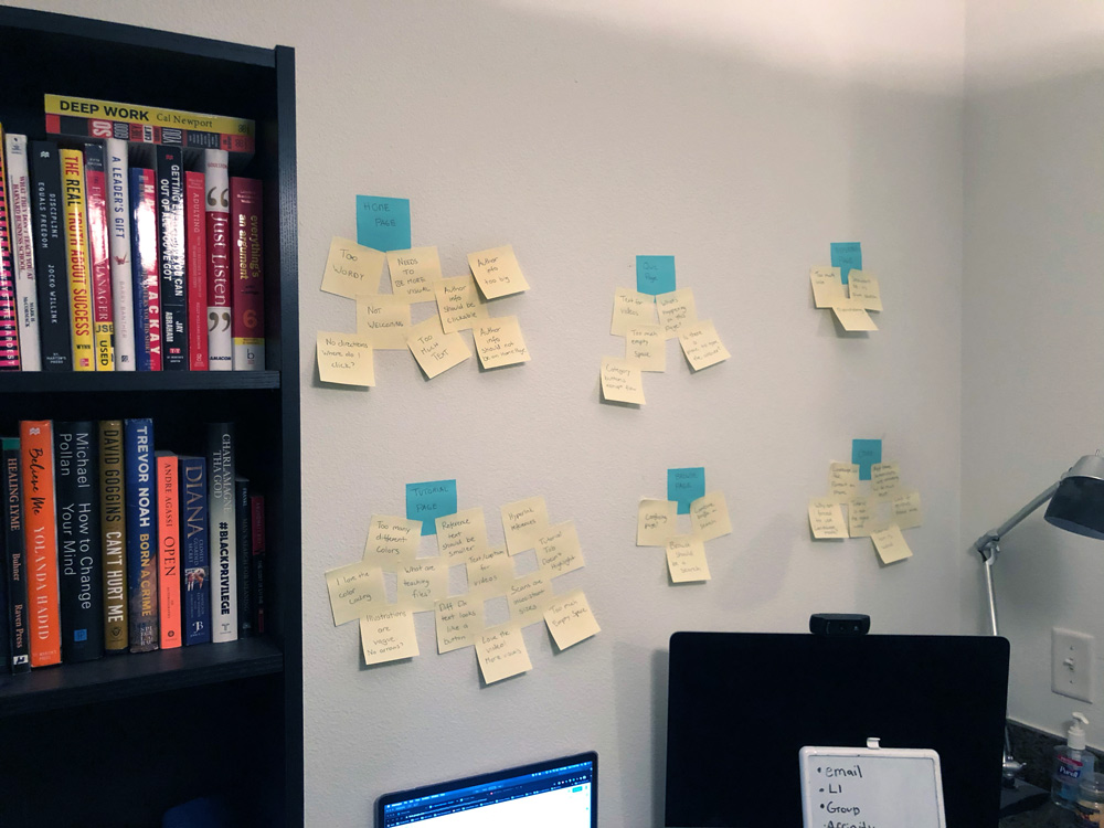
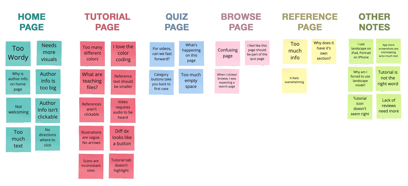
Most pages are overwhelmingly covered in text. Especially the home page. It's intimidating.
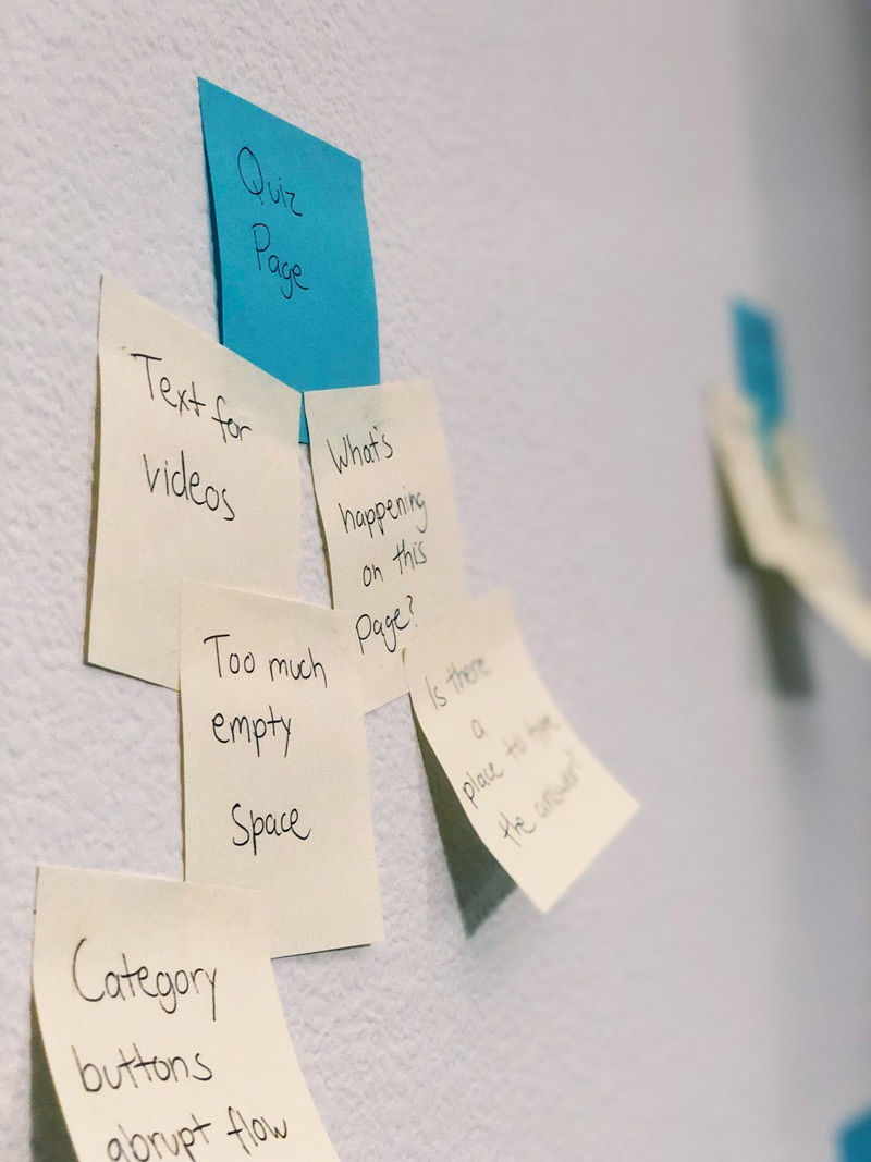
The quiz can be very confusing. There are no directions on how to start. How can I keep track of my answers?
The quiz restarts every time I try to get back to it and makes it difficult to actually learn the material.

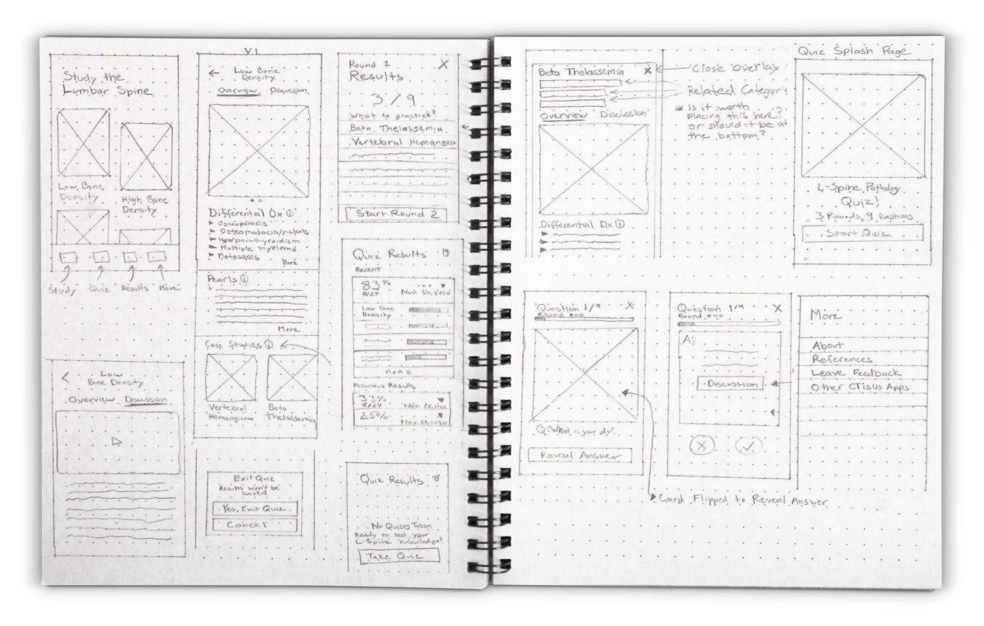
After converting the paper sketches into low fidelity digital wireframes, it was time to test our first clickable prototype.
After a second round of usability testing, here are three aspects of our product that we tweaked:
The 'Study' page was changed to the 'Learn' page after users associated a negative connotation with the word. 'Learn,' on the other hand, evoked positive emotions where as users described 'Study' as an "annoying obligation".
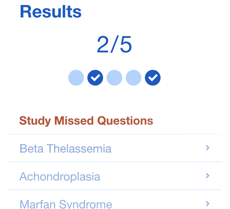
On the 'Results' page, users were confused by the headline, "Study Missed Questions". To them the term "Missed" was construed as questions that they had skipped. To remedy this, the word was changed to 'Incorrect'.
A user made us aware that separating the 'Quiz' and 'Results' page was confusing given their association with one another. Therefore, we combined the two, making the app's architectural structure even simpler, lessening the bottom tab count to just three.
You've downloaded the app! Awesome. A splash page appears as soon as it's launched, followed by a simple onboarding sequence.
Less text, larger images
No more lengthy paragraphs of text. A sequence of three onboarding screens leaves the users with a visual blueprint of what to expect from the app.
"Learn", "quiz", "improve"
Each onboarding screen uses words that emphasize the app's primary purpose – that is, to help people "Learn" the material, take "quizzes" of what they learned, and ultimately "improve" their ability to diagnose pathologies over time.
The original iPad app had 5 tabs. Our first low-fidelity iOS prototype narrowed it down to 4 tabs. And the final prototype was iterated down to 3.
Learn, Quiz, More
The new tab labels coincide with the keywords used in the onboarding sequence. Also, according to our users, they are better representative of what content is expected on each page.
Icons now built with accessibility in mind
When a page is selected, the respective bottom icon transitions to one that is filled-in, increasing readability and contrast for those with visual-impairments, specifically color-blindness.
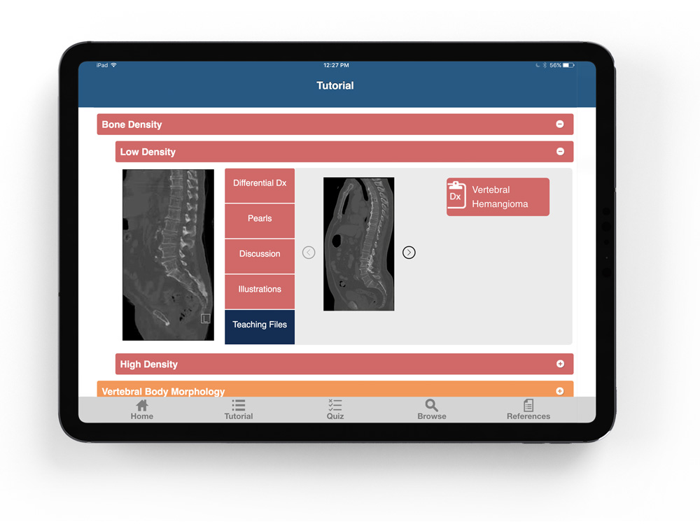
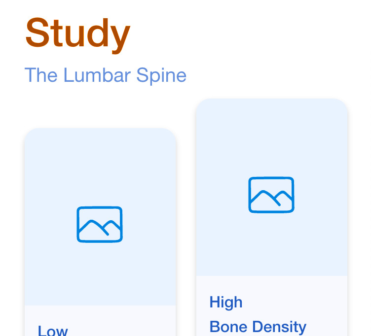
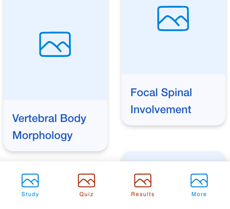
Once the onboarding sequence is completed (or skipped), the user is then presented with the Learn page, essentially the home page of the app. It showcases all the categories of L-Spine pathologies to which the various case studies can be categorized within.
Illustrations used as thumbnails for categories
We abandoned the wide toggles that the original iPad app offered and instead included illustrations, offering a visual approach to differentiating/identifying a category.
Categories are still color-coded, but less saturated
Some users loved the fact that the original iPad app had color-coded categories, while others complained that the colors were overwhelming. We therefore decided to keep a color-coded approach, but instead use pastel-esque variations of analogous colors to offer a less saturated, softer approach.
The Tutorial page is now the Learn page
This page isn't guiding on HOW to do something, as most tutorials do, so is Tutorial really the best word for this page? We found Learn to be a far more proactive word, better aligned with what the page was built for the user to do.
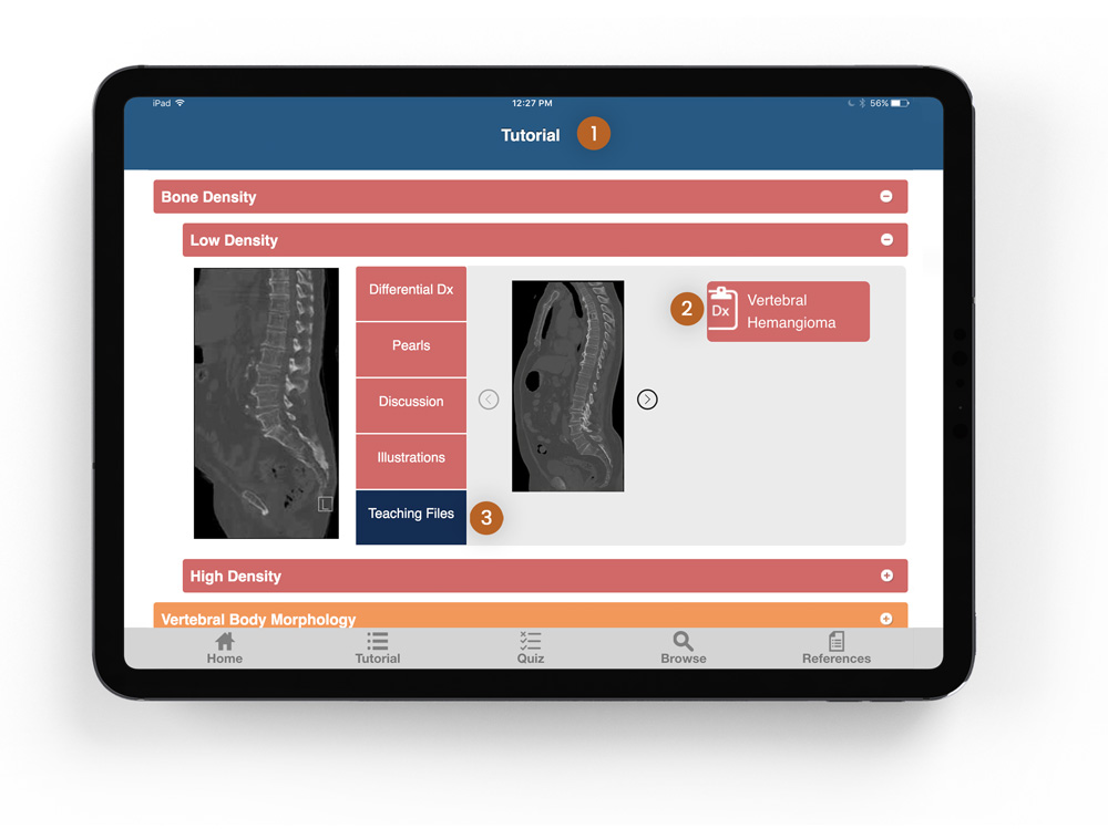
Once you click on a category, the user can access the information related to it.
'More/Less' toggle increases scanability
Originally, in order to view the contents of a category, a toggle had to be clicked on just to reveal all the information. The new design however, uses a 'More/Less' toggle to expand/contract only parts of the information. This way, the user could get a glimpse of the all content before deciding whether to read more of it, increasing efficiency of consuming the information and saving clicks in the process.
Images displayed in swipeable carousel
Why not use conformities to our advantage? We presented the scans and illustrations in a manner similar to social media platforms like Instagram.
Info toggles for unfamiliar vocabulary
While many studying radiologists were familiar with terms like Differential Diagnosis, Pearls, and Case Studies, a few weren't. With the goal of being as inclusive as possible, we added info icons to each term, which then revealed their definition if clicked.
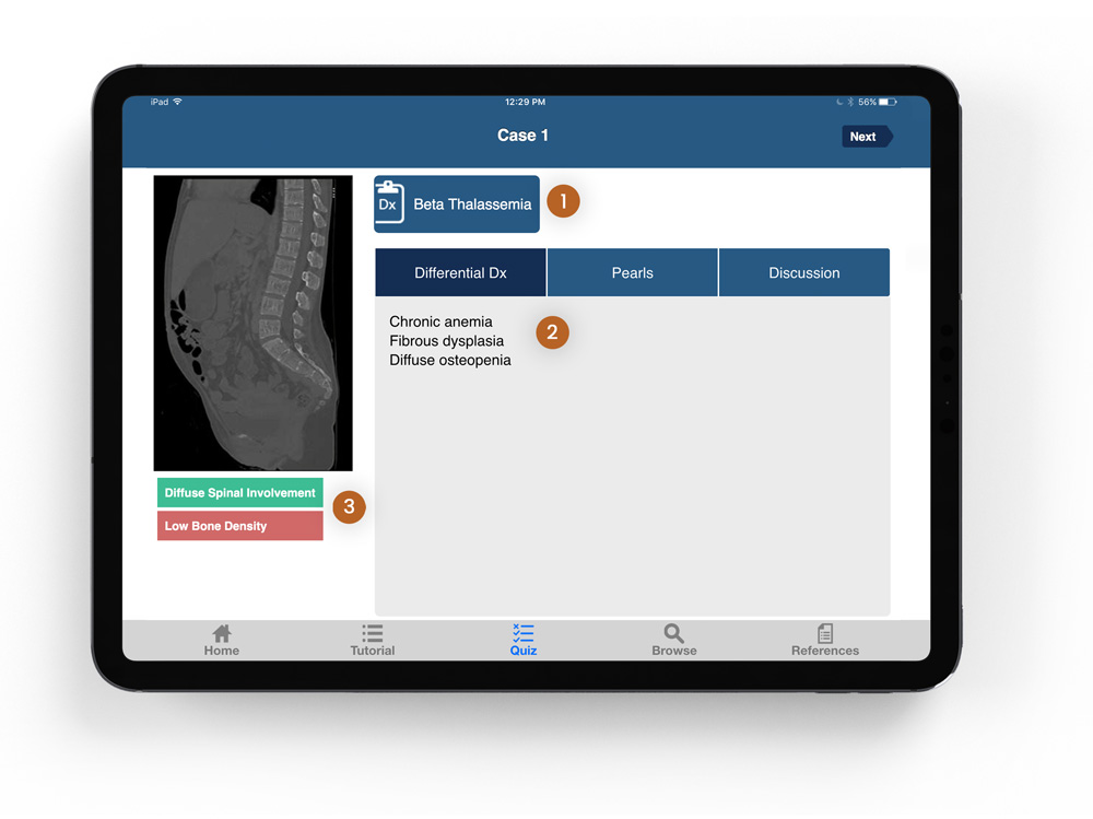
Each category has several case studies to select from. When a user clicks on one, an overlay of the case study page appears.
Same structure as Category page
To decrease cognitive load and increase user intuitiveness, we designed the Case Study page exactly like the Category page.
Revealed as an overlay
Having the Case Study page designed as an overlay instead of its own separate page was done for several reasons. 1) It clearly shows that the case study selected belongs to a specific category. 2) Having it on its own page adds a layer to the architectural flow that may cause the user to get lost within it. A user, for example, would have to click the back button several times in order to simply arrive back to the Home page. And 3) we can utilize the overlay in other parts of the app as well, specifically the Results page where users could revisit the cases if desired.
Swipe to access other Case Studies
Another benefit of having an overlay is the ability to swipe through to access other Case Studies with the category, eliminating unnecessary, additional clicks in the process.
After completing your 5 round of questions, the user is then taken to a screen with their previous results. A sliding animation is then executed, signifying the most recents results.
Your progress is now documented
In order to retain our users, and more importantly have them improve their understanding of the material, it was important to us that we enable a measurable way to document their progress. Have a list of previous results, each with a prominent indication of the percentage of questions they got correct enables this.
Each category's results are further broken up
This allows users to see which categories they need to study further.
UX Case Study
UI Practice
Medium Article